CONFERENCE FOR DATA VISUALISATION
|

|
A NEW EVENT FOR DATA VISUALISATION AND UX IN BUSINESS
Data Visualisation is rapidly growing in importance for business, and is becoming seen as a necessary investment for an organisation to use its data to improve operational effectiveness and competitive advantage. DATAVIZLIVE will bring together Business Intelligence leaders, front-end developers, data journalists, software providers, and widely-recognised Data Visualisation influencers. Speakers and attendees will discuss innovative projects, challenges and solutions, and tools and techniques that are driving businesses forward.
TRACK A: DATA LITERACY & LEADERSHIP
Leading Data Visualisation and partnering with the wider business. Advancing DataViz in business, building data literacy, enabling action Bridging the gap with business operations, integration and adoption.
TRACK B: STORYTELLING, DESIGN & IMPACT
Designing better BI dashboards, web apps, visuals and user experiences. Interactivity and user testing, how to measure and improve effectiveness Storytelling, contextualisation, emotional framing and narrative planning.
TRACK C: TECHNOLOGY & SKILLS
DataViz techniques on a variety of platforms and systems Software and technology interactive exploration Growing professionally as a designer and developer.
DATA VIZ LESSONS FROM THE LONDON TUBE MAP
This opening session will consider what we can learn from an established, successful visual design that millions of people use every year, and how to apply that to other visualisation problem/challenge contexts.

|
|
|
|
|
|
|
|
|
|
|
STORYTELLING WITH DATA: CREATING VISUAL NARRATIVES
Stories resonate and stick with your audience in ways that data alone does not. Why wouldn’t you leverage the power of story when communicating with data? Join this engaging session, during which Cole Nussbaumer Knaflic demonstrates the untapped potential of combining the magic of story with best practices in data visualisation for communicating effectively with data. You’ll leave the session inspired to bring your data to life and make it a pivotal point in an overarching story that motivates your audience!

|
|
|
|
|
|
|
|
|
|
|
|
|
|
|
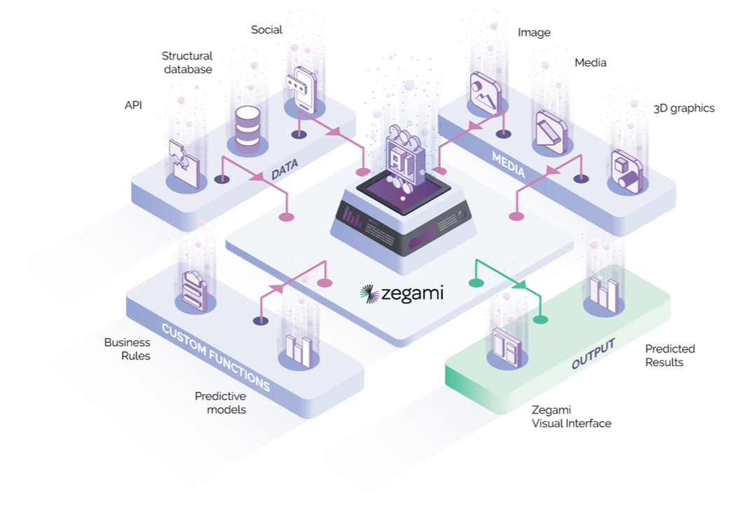
SOLVING SOME OF THE WORLD’S BIGGEST CHALLENGES USING AI AND VISUALISATION
See a completely new way to understand large silos of mixed data (images, movies, text, etc) that is both user- friendly and powerful. If your organisation is using AI, Zegami we will show you a new way to train AI models faster, more efficiently and avoid biases.

|
|
|
|
|
|
|
|
|
|
WORKSHOP ON NARRATIVE PLANNING AND CONTEXTUALISATION
Following Cole’s keynote, this session will be an opportunity to put some of those principles into practice, by creating a compelling story from the source material of a business dashboard.

|
|
|
|
A JOURNEY THROUGH THE VISUALISATION TOOLSCAPE
Come to hear an overview of the current tool space, and get a good sense as to which tool you might want to use in different situations.

|
|
BUILDING PATCHWORK DASHBOARDS IN GOOGLE DATA STUDIO
How Data Studio allowed us to democratise data through ease of sharing and a simple interface. Learn how we put ours together, and get advice on building your own.

Molly Devine
Editorial Data Analyst The Economist |

|
|
|
|
|
BUILDING AN INTERACTIVE BI USER ENVIRONMENT
The design principles and guidelines to better align with the visual Information-seeking mantra, namely ‘overview first, zoom and filter, detail on demand’; theoretical studies and major design pitfalls.

Zhao Geng
BI Analytics Lead
GlaxoSmithKline
BI Analytics Lead
GlaxoSmithKline
USER-CENTRED DESIGN FOR MORE USEFUL VISUALS AND DASHBOARDS
Understand the key steps in user-centred design, and learn some practical techniques to apply to your data visualisation and analytics that will improve user engagement and satisfaction.

Emma Cosh
DataViz Consultant
Former Head of DataViz
Tesco
DataViz Consultant
Former Head of DataViz
Tesco
|
|
|
|
EMOTIONAL FRAMING TO DRAW IN AND ENGAGE YOUR AUDIENCE
How do we connect humans and data about humans? In a world of abundant data, making sense of the noise, annotating the chaos is a fundamental communication task. Learn how to use data to articulate the message, not just support it.

Xaquin Gonzalez Viera
Former Graphics Editor
Guardian News
Former Graphics Editor
Guardian News
|
|
|
HARNESSING THE POWER OF VISUALISATION TO SURFACE INSIGHT AND STORIES FROM NUMBERS
In this age of “Big Data” and information overload, data visualisation has incredible potential to help us quickly understand, navigate and find meaning across many complex domains. In this hyper-visual presentation, David will unveil some of the interesting, unexpected and sometimes magical things that happen when you start to visualise and humanise data.

|
|
|
|
|
|
|
|
|

|

|